INTENTIONAL AESTHETIC. VISUAL VIBES. BRAND ALCHEMY.Elssai
BRAND GUIDELINES by Haus of Hazel
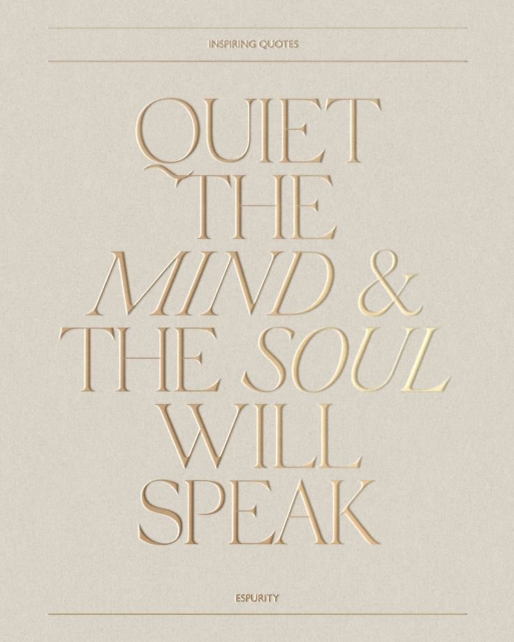
Return to Yourself. Realign your energy. Remember your truth.MAIN HEADING:
Gilda
Display Font
PARAGRAPH/BODY TEXT:
Almarai
FONTSMain Heading Font
Italics
Aa Bb Cc Dd Ee Ff Gg Hh Ii Jj Kk Ll Mm Nn Oo Pp Qq Rr Ss Tt Uu Vv Ww Xx Yy Zz
Aa Bb Cc Dd Ee Ff Gg Hh Ii Jj Kk Ll Mm Nn Oo Pp Qq Rr Ss Tt Uu Vv Ww Xx Yy Zz
I have selected this typographic pairing to express elegance without being too-wellness-chic-cool, clarity and cleanliness without coldness, and quiet feminine power. Yissel’s font choices are designed to communicate simplicity, refinement, and trust — a blend of softness and structure, intuition and professionalism. Gilda brings a sense of timeless grace and understated luxury. Its refined serif style evokes association with beautiful wellness brands while remaining reachable and welcoming — there is a felt intentional presence that feels warm, personal, and enduring (hello taurus energy).
Contrasted with Almarai, this system becomes clear, modern, and approachable. Almarai introduces readability, steadiness, and the kind of gentle structure that makes one feel safe — I have intended for this brand to communicate with calm confidence rather than overwhelm.
Together, this typographic system positions Yissel’s brand as both nurturing and elevated — a sanctuary rooted in freshness, calming simplicity and alignment.
BUTTONSelssaiA Sanctuary for Healing, Consciousness & Inner Return
Yissel’s brand is a grounded yet mystical healing space devoted to helping people move from overwhelm, heaviness, and disconnection into peace, clarity, and authentic alignment. Her presence feels like stepping into a forest after rain—fresh, calm, alive, and quietly transformative. With a blend of energetic modalities and deeply human compassion, she offers clients not escape, but remembrance: the reconnection to who they truly are beneath stress, fear, and conditioning.
Clients should feel:Safe
Seen
Lighter
Clearer
Hopeful
Reconnected
Her chart supports this beautifully: Taurus Rising gives trust, calm magnetism, sensual earth energy and reliability. Mercury in Gemini in the 2nd House gives the gift of clear communication around value, self-worth, and translating spiritual ideas into accessible language. Venus in Cancer in the 3rd House creates nurturing communication, emotional safety, warmth, and a soft feminine brand presence. Capricorn MC indicates a respected public image built over time through professionalism, wisdom, and meaningful leadership.

BRAND VISION & MOOD BOARD

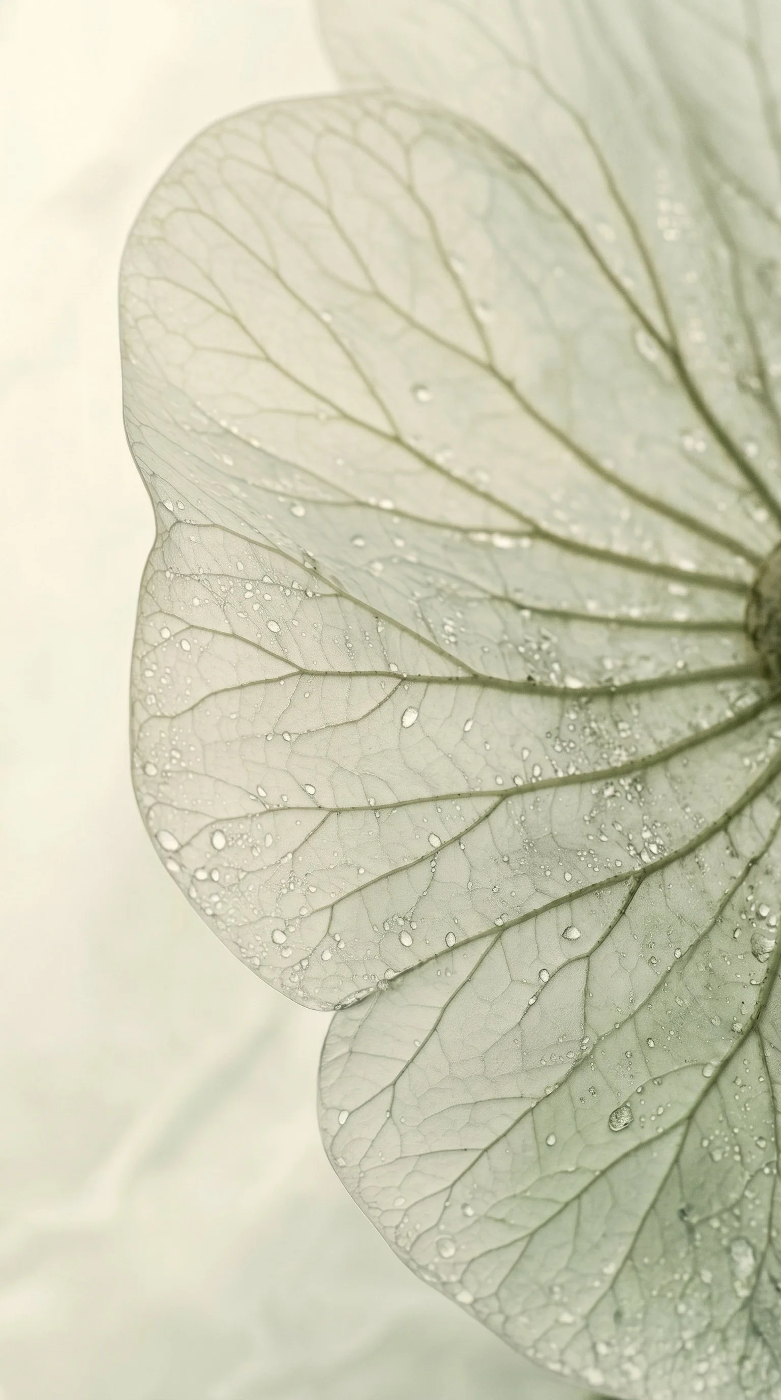
CURATED ON-BRAND STOCK IMAGERY
ASSET COLLECTION
50+ on-brand images intentionally selected already uploaded into website backend for marketing material use

Brand Goals
BRAND VALUESAuthenticity • Connection • Healing Consciousness • Integrity
BRAND PURPOSETo guide people back into alignment with their authentic self through healing, awareness, and nervous system restoration.
VISIONTo become a globally respected healing and consciousness brand creating transformational experiences, retreats, education, and community spaces that elevate collective wellbeing.
MISSIONTo make complex wisdom usable in real life — through the body, through practice, and through lived experience — supporting people to align with their purpose, deepen their work, and embody the intelligence guiding their lives.
BRAND PROMISEWhen you enter Yissel’s world, you will feel safer, clearer, lighter, and more connected to your own wisdom.
Differentiators From Other PractitionersElegant Simplicity
Clear, uncluttered offers and communication.
Multiple Modalities, Intuitive Delivery
Sessions tailored to what is needed.
Consciousness AND Nervous System Lens
Healing framed through both energetic and practical understanding.
TARGET AUDIENCEEntrepreneurs, leaders, creatives, sensitive high-achievers seeking energetic recalibration.
Women and men aged 28–55 who:
Feel disconnected despite “having it all together”
Are spiritually curious
Feel stressed, burnt out, emotionally heavy
Want healing without fluff
Value depth, wellness, nervous system repair
Have done some personal development already
WEBSITE MAIN GOALConvert visitors into:
Booked healing sessions
Email subscribers — to build for future visions like retreats and group offers
TECH STACKSquarespace Website
Squarespace Scheduling — client booking system, calendar + availability management, email reminders
Stripe — payment processor connected to Squarespace Scheduling for all bookings (or deposits)
Colour Palette
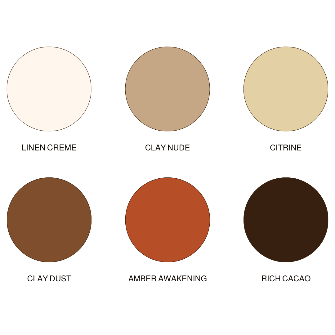
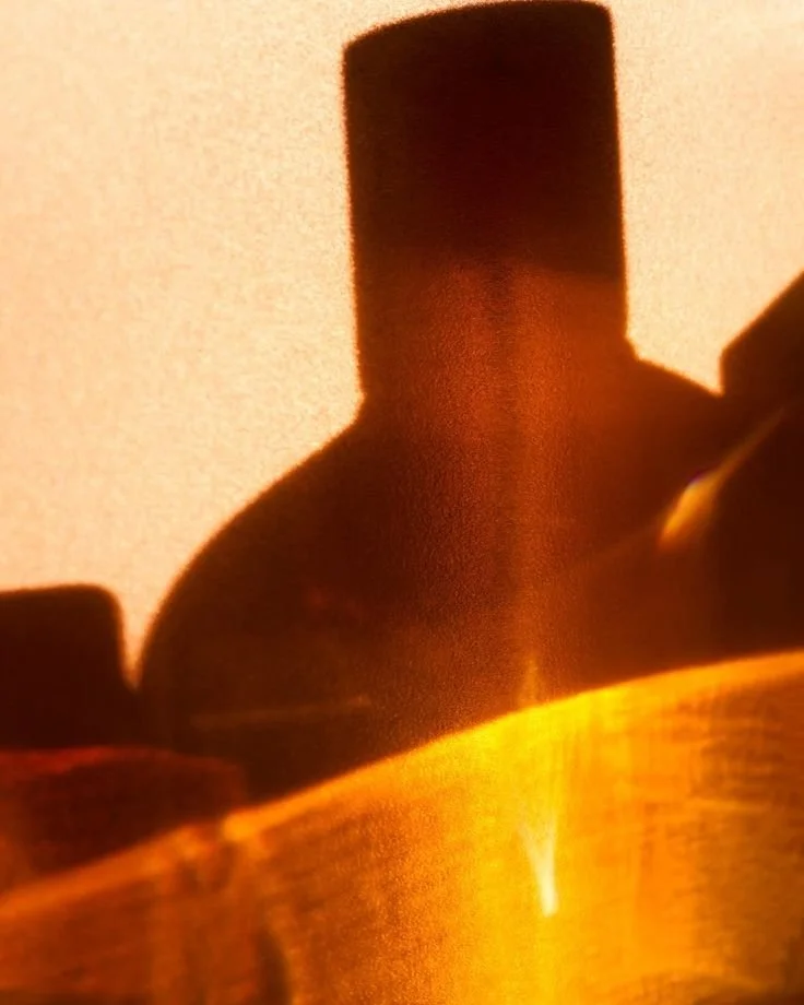
a colour palette that feels likegolden honey and amber catching in the sun. liquid light and cloudy haze daydreams. the exhale of afternoon rays dancing through forest leaves, gentle mist and smell of earth after rain.


ELSSAI
RETURN TO YOURSELF
healing begins where pressure ends.
Colour Psychology & Associations
The colour palette of Elssai reflects healing, grounded transformation, and quiet feminine power.
It’s soft, but not dreary or flat — there’s an activation embedded in the ancient relationship we have with the sun and its rays, and the rich earth below our feet. It evokes the feeling of exhaling after carrying too much for too long — warm earth beneath bare feet, golden light after rain, the stillness of nature restoring what modern life has pulled apart.
Together, these colours form a palette that mirrors Yissel’s work: gentle yet powerful, calming yet catalytic, earthy yet elevated. It is the visual language of remembrance — helping people move from heaviness into harmony, from disconnection into self-return.
Linen Creme offers spaciousness, softness, and emotional relief. Clean without feeling clinical, it creates room to breathe. Traditionally associated with purity, simplicity, and calm, it becomes the energetic pause within the brand — the blank canvas where healing begins. Linen Creme feels like sunlight through curtains, fresh sheets, or the first clear thought after mental overwhelm.
Clay Nude introduces warmth, embodiment, and human connection. This tone carries the psychology of safety, sensuality, and grounded femininity. It reminds us of skin, earth, pottery, and touch — the simple beauty of returning to what is natural. Clay Nude makes the brand feel approachable, nurturing, and deeply real.
Citrine brings light, hope, and gentle expansion. Associated with optimism, abundance, and mental clarity, it acts as the spark of awakening within the palette. Like sunlight filtering through trees or the golden edge of dusk, Citrine represents the inner wisdom already present within each client, waiting to be SEEN.
Clay Dust adds steadiness, resilience, and rooted warmth. Psychologically, browns create feelings of reliability and comfort — the sense that one is held by something stable.
Amber Awakening is the transformational fire of the palette. Warm, radiant, and alive, it symbolizes vitality, courage, and movement after stagnation. Amber tones are traditionally linked to creativity, confidence, and life force energy. This colour mirrors the moment a client begins to feel themselves returning — clearer, brighter, more empowered.
Rich Cacao anchors the palette in depth, wisdom, and sacred mystery. Dark browns evoke protection, seriousness, and primal grounding. Rich Cacao carries the energy of fertile soil, shadow work, and ancient knowing — the unseen realm where true transformation first begins. It adds elegance and gravitas while reminding us that growth often starts in the dark.
Brand Astrology
-
Rising Sign
Physical body
Appearance + style
Personality + character
Truth illumination
What people notice about you
The “face” you put on
Your motivation for living life
Outward emanation
Your rising sign broadcasts your medicine for you quite naturally. It is likely what people have reflected back to you as qualities they receive from being around you. This is the role you came to play.
TAURUS RISING: Sensual. Embodied. Earthy. Stable. Luxurious. Opulent. Wealth. Fertility. Abundance. Being a grounding force. Pleasure. Embodiment. Speaking to audience's sensations and desires.
-
Messenger. Intellect. Clever. Curious. Trickster. Brilliant. Dual. Airy. Light. Quick. Changeable. Shapeshifter.
-
Safety. Sanctuary. Home. Nest. Divine Femme. Mother. Nourishment. Nurturer.
Mercury CODES
YOUR COMMUNICATION PLACEMENT
Ruler of communication
Articulation
How you share yourself
Speaking
Copywriting
Mindset + perception
Learning style
The Mercury placement gives us valuable information about how you are already wired to express and communicate, and the most align way to share your unique message. These are your gifts of communication and articulation, so that your dream clients can really receive you.
Leverage this code in your content creation for your aligned audience to resonate with you and disrupt any outdated paradigm marketing + sales tactics that don't feel good for you.
Venus AESTHETIC
YOUR MAGNETISM PLACEMENT
Where you’re charmed or lucky
Most ease in manifesting
How you connect with others
Attraction + desire
Beauty + aesthetic
Ease in sales
Receptivity
Your Venus reveals where and how you are most magnetic, and your most exalted state of attraction. This speaks to the environments and energies that align you to your receptive mode and what people love to pay you for.
Working with your Venus brand code increases magnetism, so it is what we focus on most for visual identity, aesthetic and "vibe" to exude.
Brand Tone & Voice
Mercury in Gemini gives:
Ability to simplify spiritual concepts
Great educational content
Variety in messaging formats
Curiosity and relatable language
Strong social media communication
Venus in Cancer gives:
Nurturing tone
Emotional intelligence
Maternal warmth
Safety-first messaging
Deep care in wording
Tone Words
Calm
Wise
Softly powerful
Reassuring
Clear
Conscious
Elegant
Genuine